Evolutionary algorithm assisted antenna design
I wrote an evolutionary algorithm in Python to optimize the antenna shape for communications antennas, the final design is to be used on F-5 Navy training jets.
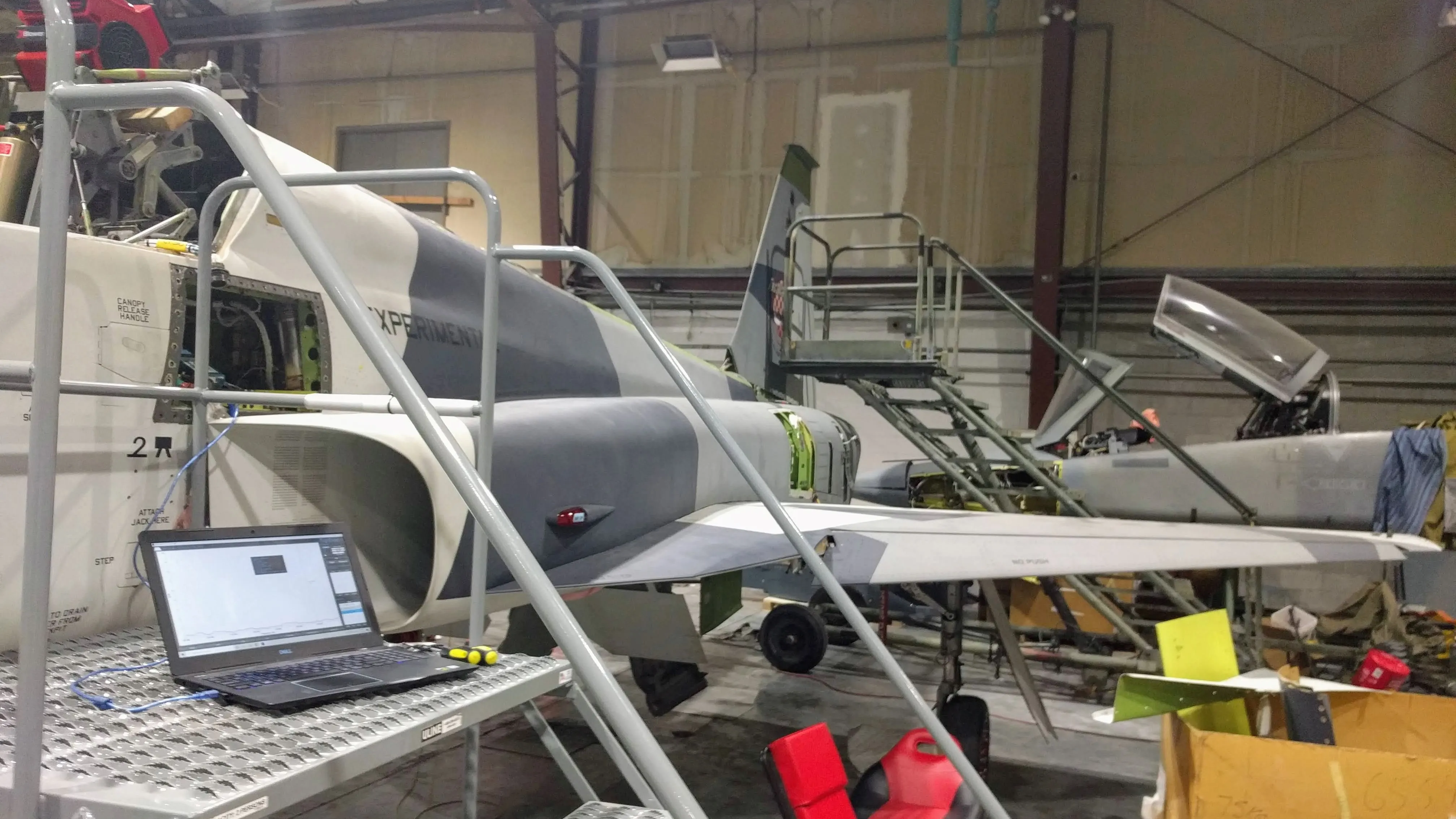
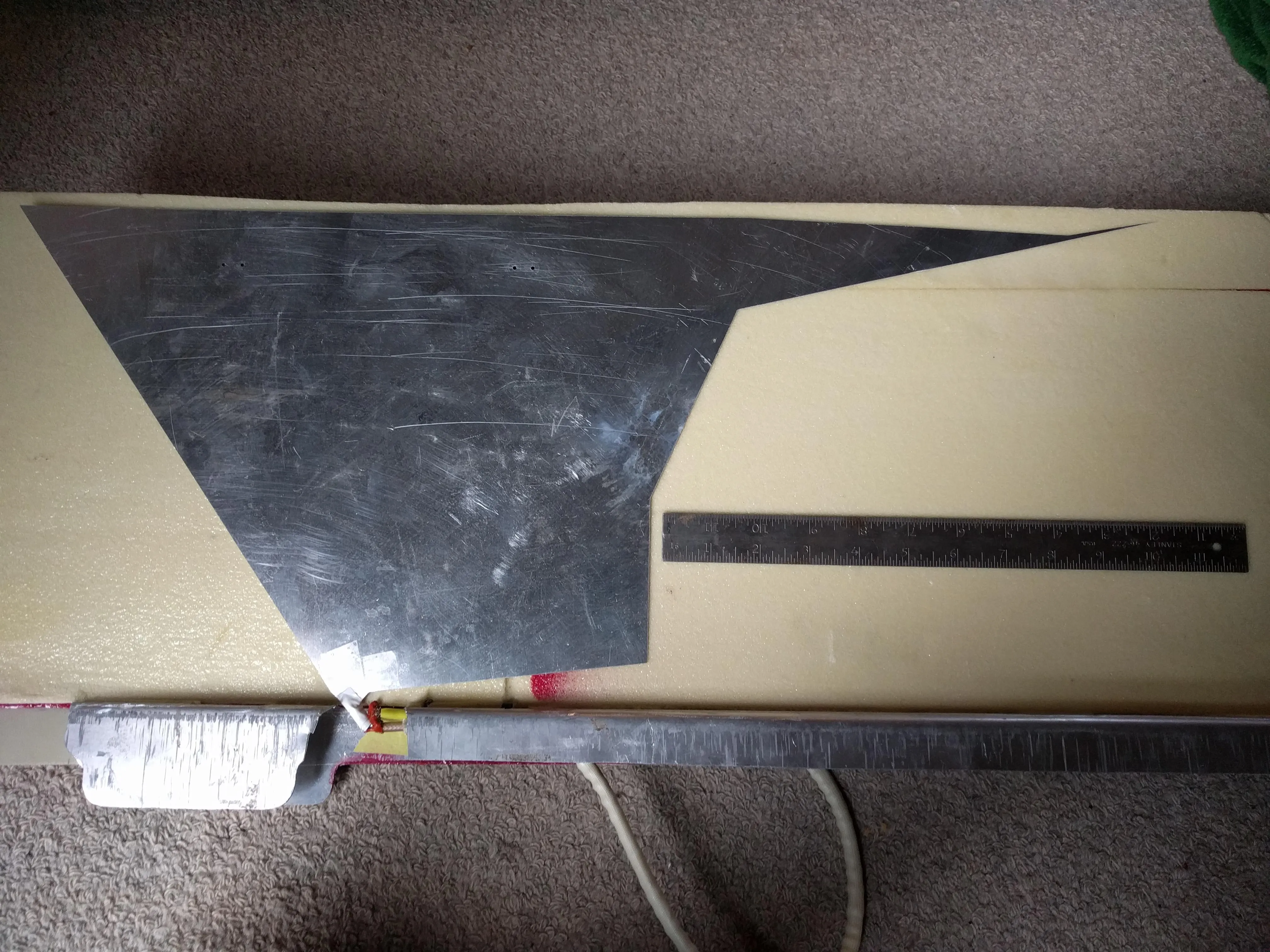
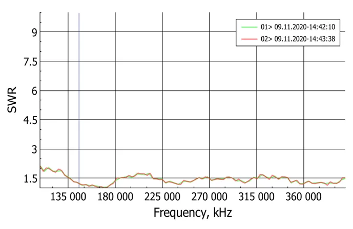
The plate antenna operates from 108-400MHz, the evolutionary algorithm designed antenna is about twice as good as the old design and exceeds the specification by 25%. Here is the paper I wrote on the process. I used necpp to simulate the antennas in Python and RigExpert to test them in the real world. I gained experience using Linux in a virtual machine environment and knowledge about antennas and their design.
The final design is a unique and unusual shape for an antenna. Interestingly, even on completely separate executions of the optimization algorithm, this general shape was created, suggesting it is near optimal.
The following is a graph showing the effectiveness of the antenna at different frequencies, lower is better, 1 is best. These results were later verified by a third party.
A* Pathfinding
As part of my work on the motion planning team of Cornell’s Aerial Robotics club, I implemented and benchmarked a few different implementations of A* and related algorithms in Java and C, including Dijkstra’s shortest path algorithm and jump point search. I also implemented a binary heap in both languages. Here is the final code for Java and C. I gained a significant understanding of pathfinding algorithms as well as some techniques for optimizing code. Here are the benchmarking results.
| Grid Size Start → End | Grid Type | A* Java | JPS Java | A* Bits Java | A* in C |
|---|---|---|---|---|---|
| 100 x 100 (0,0) → (99,99) | empty | 11ms | 12ms | 8ms | <1ms |
| w/ open box from 2 to 66 | 51ms | 97ms | 34ms | <1ms | |
| w/ wall from (97,99) to (97,1) | 121ms | 106ms | 87ms | <1ms | |
| 1,000 x 1,000 (0,0) → (999,999) | empty | 77ms | 42ms | 23ms | 20ms |
| w/ open box from 2 to 666 | 5.1s | 9.4s | 1.5s | .24ms | |
| w/ wall from (997,999) to (997,1) | 15s | 2.1s | 2.8s | .7s | |
| 2,000 x 2,000 (0,0) → (1999,1999) | empty | 138ms | 62ms | 40ms | 23ms |
| w/ open box from 2 to 1666 | 72s | 140s | 8.8s | 2.1s | |
| w/ wall from (1997,1999) to (1997,1) | 155s | 17s | 10s | 2.86s |
Procedural Timelapse Photos
Inspired by a Ted Talk by Stephen Wilkes, I created a version of his photos using Python.
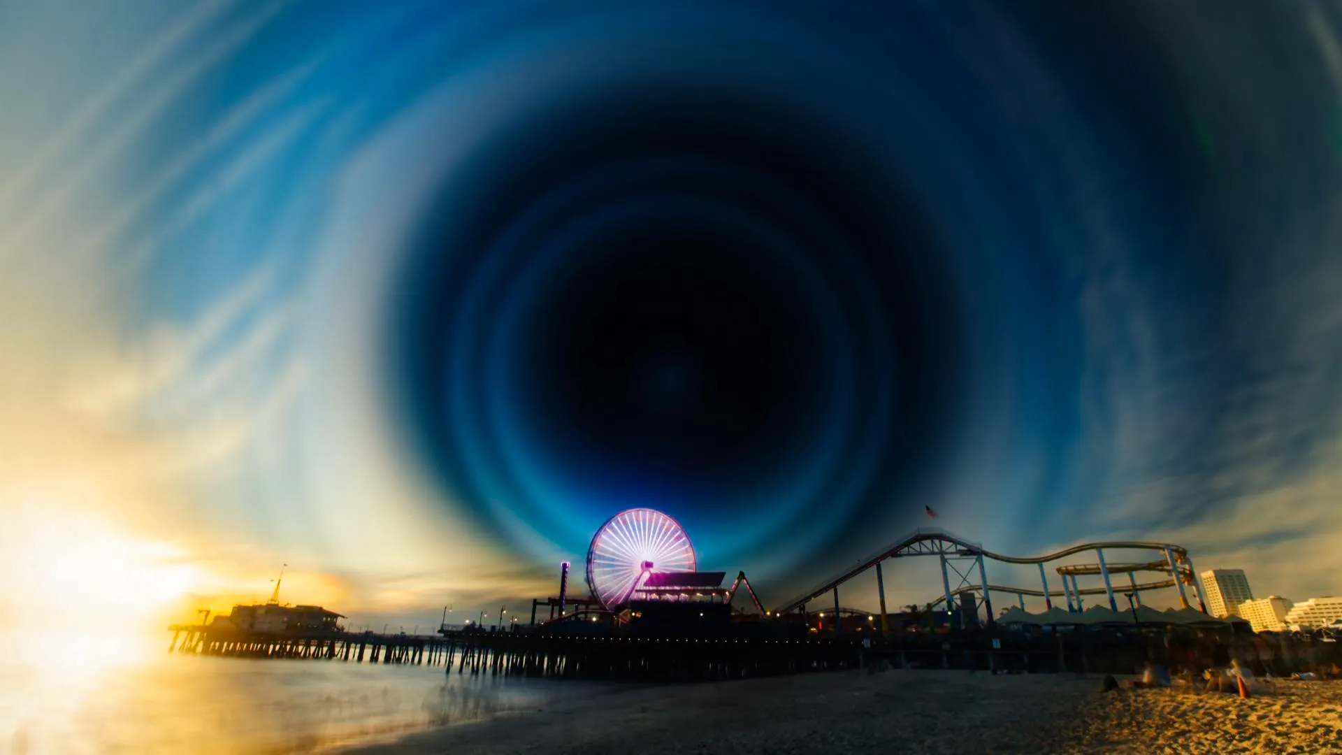
I used PIL, FFmpeg, multiprocessing and NumPy, the final code for the project is here. Stephen Wilkes creates them manually, painstakingly picking out the most interesting subjects and times of day and manually blending them to create his images. I wanted to simplify the process, using frames from a timelapse video and procedurally blending over time to create a similar effect.
View Project LogsFourier Transform Demonstration
I created a visual demonstration of the Fourier transform in the complex plane. The code takes hand drawn paths and constructs a visual representation of the frequency deconstruction. The final drawing is made of many values (represented by the lines) rotating at a constant frequency.
The original idea comes from this video by 3Blue1Brown. I created a version of his photos using Python. I used Pygame to draw and get user input. The code works by sampling the mouse position at a constant rate and then, using a discrete Fourier transform (DFT), determining the frequency, amplitude and phase components of the signal. This works in two dimensions by considering the points to be in the complex plane, that is for a point (x,y) the value is x + yi. The final animation is then drawn with circles and rotating lines.
An interesting byproduct of sampling the mouse position at a constant speed is that the animation will play at the same speed that the picture was drawn. This means even discountinuous jumps are possible. The end result is a straight line between the two points.
Climate Visualizations
To learn a bit about Python's pandas library, I created some visualizations of historical weather data from OpenWeather. I used their History Bulk data for Diamond Peak, a small ski mountain, to create the visualizations. The dataset was made of hourly reading going back to Jan 1, 1979 including temperature, snow fall and rain fall, which were the most interesting to me. Since my goal was to learn pandas, I tried lots of different ways to visualize the data. There ended up being a few interesting ones. Here is a GIF showing the yearly the mean, maximum and minimum temperature over time:
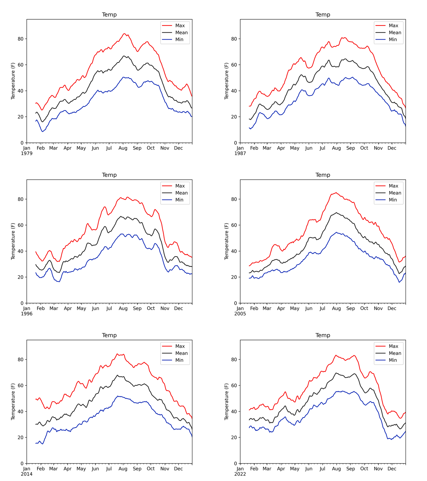
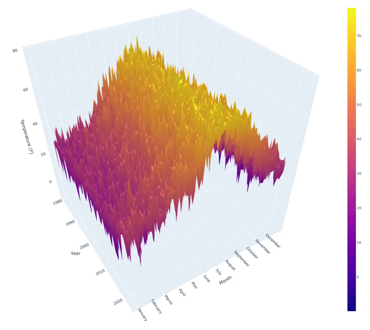
Which I realized was challenging to understand, so I created a 3D visualization of the average temperature for every day they had recorded, which was a bit better (click to interact):
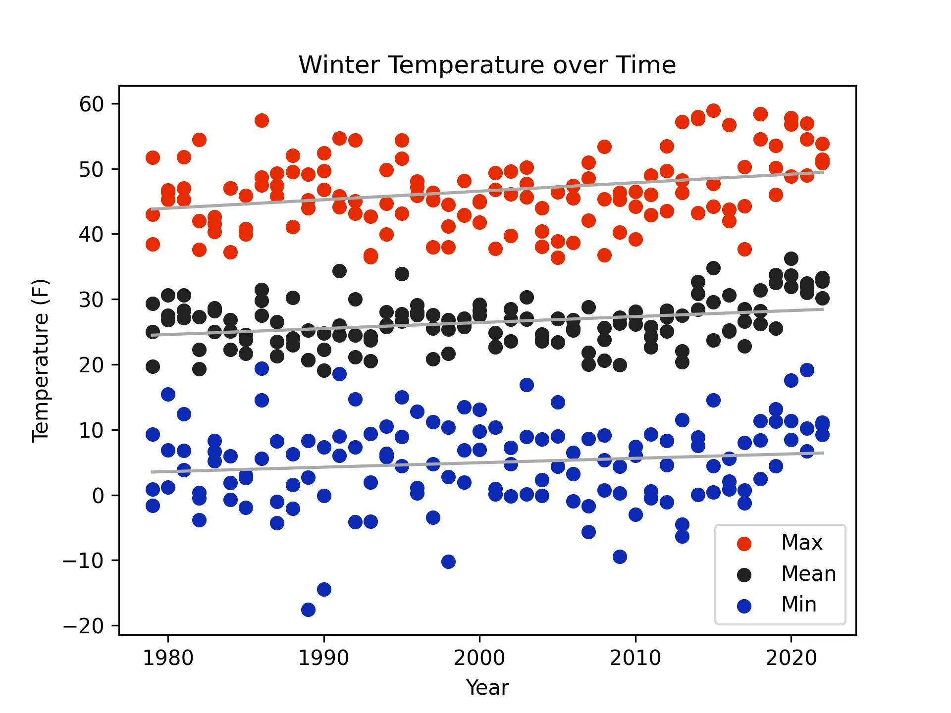
Then I cut out the subjective analysis and created a graph showing the mean, maximum and minimum temperature during the winter months, with a linear regression:
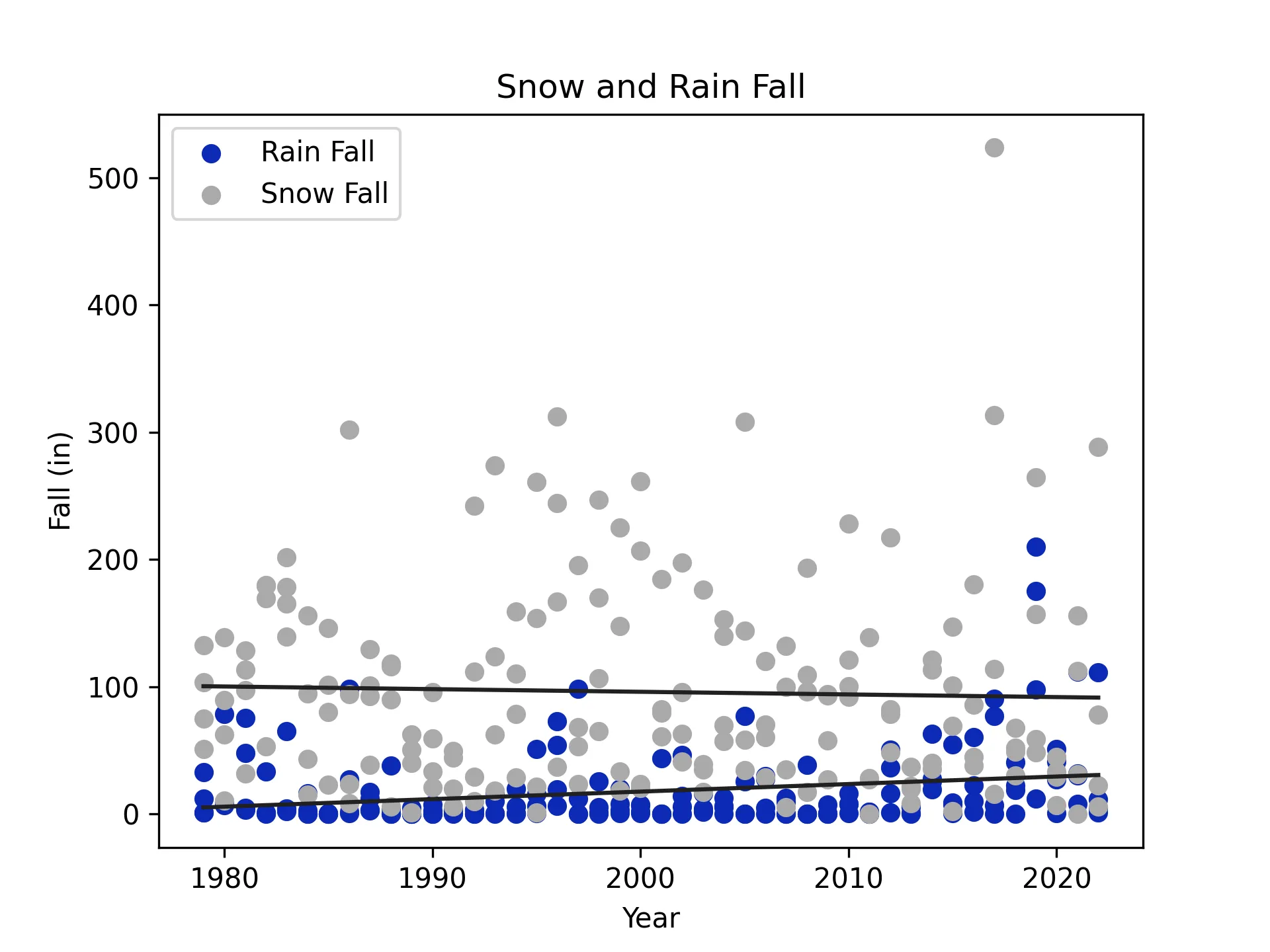
I also created these snow and rain fall graphs, again with linear regression.
